Typography - Final Compilation & Reflection
29 Aug – 28 Nov 2023 || (Week 1 – Week 14)
Kek Han Shin || 0352571
Typography || Bachelor Of Computer Science || Faculty of Innovation & Tech.
Final Compilation & Reflection
INSTRUCTIONS
💡Task 1: Type Expression & Text Formatting
SUBMISSIONS
💡Task 1: Type Expression & Text Formatting
29 Aug 2023 - 06 Oct 2023 || Week 1-Week 6
JPEG Format
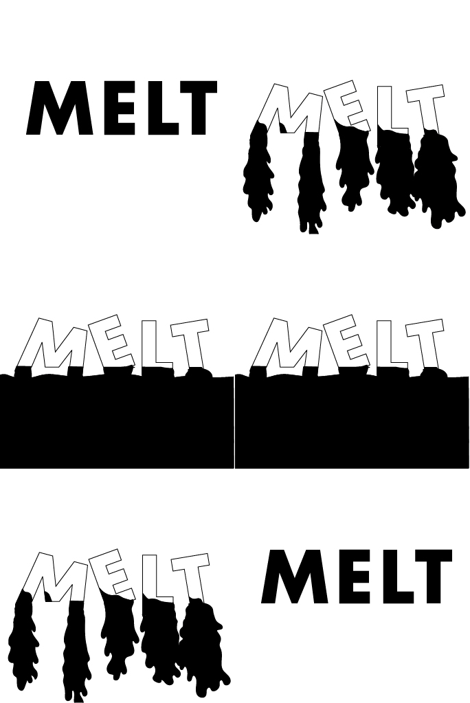
Figure 1.2 Final type expression "glitch, roll, sleep, melt" (PDF), Week 4 (17-Sept).
Animated GIF
💡Task 2: Typographic Exploration & Communication (Text Formatting & Expression)
19 Sept 2023 - 03 Oct 2023 || Week 4-Week 6
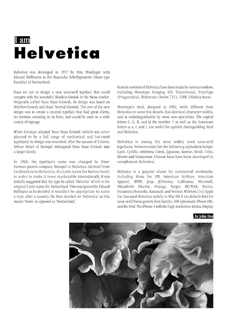
⭕JPEG, 300PPI, Grayscale
 |
| Figure 2.1: Task 1 Exercise 2 without grid - JPEG; Week 5 (24-Sept) |
⭕PDF without guides and grids
Figure 2.2: Task 1 Exercise 2 without grid - PDF; Week 5 (24-Sept)
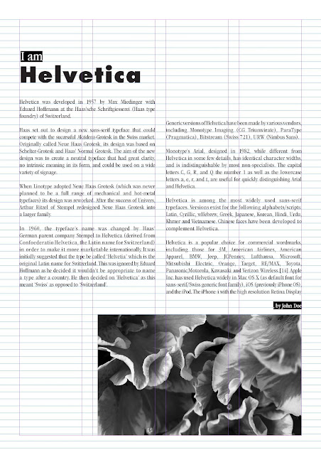
⭕ JPEG guides and grids
.jpg) |
| Figure 2.3: Task 1 Exercise 2 with grid - JPEG; Week 5 (24-Sept) |
⭕PDF with guides and grids
Figure 2.2: Task 1 Exercise 2 with grid - PDF; Week 5 (24-Sept)
💡Task 3: Type Design & Communication (Font Design and Text Poster)
 |
| Figure 3.1 - final decided sketch, Week 09 (24 Oct) |
Name:
Armor /ˈɑːmə/ the metal coverings formerly worn to protect the body in battle.
With pointy edges the typeface resembles the armor that protects knights that in turns protect the land.
Font download link:
https://drive.google.com/file/d/1sDv5RfPMMILfmG1w9HSa223Pq3pOc_a7/view?usp=drive_link
 |
| Figure 3.2 - Final Task 3A: Type Design and Communication "Armor Text" - JPEG , Week 13 (21 Nov) |
Figure 3.3- Final Task 3A: Type Design and Communication "Armor Text" - PDF , Week 13 (21 Nov)
Font Poster in A4 size: |
| Figure 3.4- "Armor Text" Typo Poster - JPEG , Week 13 (21 Nov) |
Figure 3.6- "Armor Text" Typo Poster - PDF, Week 13 (21 Nov)
SUBMISSIONS
🚶🏼♀️Experience
To be honest it still felt surreal to manage to reach the end of this journey, looking back it definitely is not an easy one and I still remember how much culture shock I had during the first few classes 😂As a computer science student this is my first semester having creative media module. I definitely did not expect a design module can involve this huge amount of effort and learnings. But this did fulfilled the initial intention of mine as it felt like I am exploring a new field. Although it was a stressful one, throughout the process I appreciate Mr Vinod although I am always intimidated and I am always falling behind :"D If it is not his guidance and patience I would not learn this much, totally did not expect this module to be one of the most memorable one to date. This module had made me notice the development of typefaces, even now I notice myself starting to notice and observe the fonts appearing on signboards and buildings...... I might not be having as sharp artistic sense as a design student, but I do find myself progress and grow, and that is definitely fulfilling.
🚶🏼♀️Observation
Words, typeface, fonts they have their own personalities. How bold or thin the strokes are, how different qualities combined together form different characteristics are the things that intrigued me. I observed even I read through a lot paragraphs, looked at a lot of sign boards, typography is everywhere but I tookpaid little attention to these fonts and how they convey a message. I learnt that the font type plays a huge role in expressing meaning in task 1, I learnt that formatting and layout of paragraph plays determining factor in improving reading experience in task 2, finally in task 3 I learnt that behind all type designs takes considerable amount of diligence and attention to detail. I learnt that each letters follow different rules, spoken or unspoken ones. And it takes one's time and effort to make a satisfactory typography work, either in this module itself or in ancient or even modern typography development process.
🚶🏼♀️Findings
I find it intriguing when it comes to typography as mentioned this is my first time having design module, it gives me a new perspective that art is not always random or freeform manner but in typography there are rules and conventions that are passed through decades, and it is still applicable till today. As a computer science student I'm not resistant towards this, but it does add more mystery to me on how the artistic side of world works as I am always studying the scientific side. And along the way I am more sensitive when it comes to advertising or sign boards where I look into what font type they use, does it suit the message trying to be conveyed, how are the whitespace distributed, etc. I might not be the most professional or knowledgeable, I am still learning, but it does really gives me a new perspective which I think will definitely be beneficial.


Comments
Post a Comment