29 Aug 2023 - 06 Oct 2023 || Week 1-Week 6
Kek Han Shin || 0352571
Typography || Bachelor Of Computer Science || Faculty of Innovation &
Tech.
Task 1: Exercises 1& 2
TABLE OF CONTENTs
1.
Lectures
2.
Instructions
3.
Process
3.1
Research
3.2
Ideation
3.3
Final Outcome
4.
Feedback
5.
Reflection
6.
Further Reading
1. LECTURES
 |
| Figure 1.1: Typography illustration text, Week 1 (28-Aug) |
Lecture 1: Typo_0_Introduction
Typography is the act of creating letters, and creation of typefaces
like
Typography is also applied in animation, and the intuitiveness of website
designs, signage designs, all these
aim effectiveness of information they are trying to convey. Below is
when typography plays a part when designing logo, sensitivity and skills are
required to produce a crafted piece

|
|
Figure 1.2: Typography deals with word formation, and the
structure, Week 1 (28-Aug)
|
The evolution of typography⬇
calligraphy (way of writing) > lettering
(arrangement and composition of letters) > typography
The given definition of typography available:
[Oxford] the art or work of preparing books, etc. for printing, especially of
designing how text will appear when it is printed
[Wikipedia] Typography is the art and technique of arranging type to make
written language legible, readable and appealing when displayed. The
arrangement of type involves selecting typefaces, point sizes, line
lengths, line-spacing (leading), and letter-spacing (tracking), as well
as adjusting the space between pairs of letters.
Typography practitioners:
🟡typesetters
🟡compositors
🟡typographers
🟡graphic designers....
Terminology
-
Font
individual font or weight within the typeface
-
Typeface
entire family of fonts/weights sharing similar characteristics

|
|
Figure 1.3: Example for terminology, Week 1 (28 Aug)
|
Lecture 2: Typo_1_Development
The development of typography:
Early letterform development - Phoenician ~ Roman

|
Figure 1.4: Scratching into wet clay or carving into stone, and
the structure, Week 2 (03-Sept)
|
- where forms of uppercase letterforms have evolved from
- simple combination of straight lines and circles
- Greeks changed writing and reading direction and orientation

|
Figure 1.5: Letters in Roman Forum, Week 2 (03-Sept)
|
- Roman carvers changed qualities of their strokes
The development of early letterform is shown as below:

|
Figure 1.6: Letterform development, Week 2 (03-Sept)
|
Hand script from 3rd - 10th century C.E
The letters evolved
into compressed version of square capitals, mainly be written by pen and
brush. Rustic capitals are allowed but readability is sacrified due to
compressed formation.
Eventually Uncials was invented with some roman cursive incorporation.
Blackletter to Gutenberg's type
Standardizing different forms of lettering to ease the record of
information, also in religious setting as writing is domain of religious
order
It is important to digitalize varying typeface from different culture and
community so that they are not lost.
Lecture 3: Typo_3_Text_P1
⌨Kerning & Letterspacing
- adjustment of space between letters
-
either use letterspacing and kerning depends on the publication usage or
the space available
❓ when to kern when to letter space - no
kerning when there are large amount of body paragraph, kern when there
is just headlines, for example when the title is all UPPERCASE we widen
the letters
-
proceeding viewers are shown around how to work with kerning in
"indesign"
- to kern: ctrl + < (to edit: keyboard increments)

|
Figure 1.7: difference between letters with &without
kerning, Week 3 (18-Sept)
|
- different type of tracking - normal, loose and tight tracking
-
letter spacing in lowercase letters is not desired as it reduces
readability

|
|
Figure 1.8: the letters with letter space is harder to read,
Week 3 (18-Sept)
|
⌨Formatting Text
-
Flush left
each line starts with the same point but the end is
whenever the last words end - ragged right. Space between words are
consistent, allowing a balanced gray value. It is important to make sure
the ragging in the right smooth.
-
Centered
Should be just used sparingly for smaller amount of body
text.
-
Flush right
Putting emphasis on the end of the line, suitable for
certain circumstances like caption beside an image
-
Justified
avoid "rivers" - unwanted broad empty gaps between
letters

|
Figure 1.9: Flush left, centered, flush right, Week 3 (18-Sept)
|
As designer it is important to balance between readability and the choice
of typeface and letterspacing, do not use uppercase for certain fonts that
are naturally not designed for the purpose
⌨Text Texture
below are important lettering terms

|
|
Figure 1.10: anatomy of a typeface, Week 3 (18-Sept)
|
-
There are different type of fonts that is designed for screen reading
and suitable for different sizes
-
type size - large enough to be easily read
leading -
too tight text cause reader to loose focus, too loosely text reader can
get easily distracted
line length - rule of thumb is keeping
length between 55-56 characters
⌨Type specimen book
samples of typefaces in different sizes

|
|
Figure 1.11: Type specimen book, Week 3 (18-Sept)
|
Lecture 3: Typo_4_Text_Part 2
⌨Indicating paragraphs
- Pilco
-
The leading space should be 2 points larger than the point size (for
example 10pt font, leading space 12pt) - to ensure cross alignment and
good reading rhythm
- line spacing = line of type + leading
- the indentation should be same as point size of the text
- indentation is best to used on justified text
⌨Widows and Orphans
-
widows - short line of type left alone at the end of column of text
- orphan - short line of type left alone at the start of new column

|
Figure 1.12: widow and orphan, Week 3 (18-Sept)
|
-
solution to widows - rebreak line endings, maximum +- letterspacing
orphans
require more care
⌨Highlighting text
- make it italic
- change font color - cyan, magenta, black
-
changing font type you might need to reduce the font size - for example
serif is just larger than new roman
- reduce size of numbers by 0.5 pt
- bullet points within margin / not within margin?

|
|
Figure 1.13: different arrangement of bullet points, Week 3
(18-Sept)
|
⌨Headline within text
-
It is typographers task to make sure the readers easily understand the
level of importance within heads and their relationship to each others
-
A head - clear breaks between topics within a section
B head - new supporting arguments subordinate to A head, should not
interrupt the visual appearance of A head
C head - highlight
specific facet of material within B head text
⌨Cross alignment
-
articulating the structuredness and rhythm across lines and paragraphs
-
the left body point size + right body point size = leading and make the
base line the same you will get cross aligned outcome

|
Figure 1.14: cross aligned body text, Week 3 (18-Sept)
|
Lecture 4: Typo_2_Basic
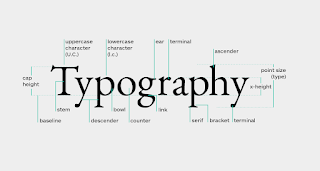
📝describing letterforms
-
baseline - visual base of letterfor ms
Median - line defining x height of letterforms
X-height - height
of the letter "x"

|
Figure 1.15: Describing letterforms, Week 3 (18-Sept)
|
-
Stroke
Apex/vertex - point created by joining 2 diagonal
stems (apex - above; vertex - below)
-
Arm
Ascender
Barb
Beak
Bowl
Bracket
Cross
Bar / Cross Stroke
Crotch
Descender
Ear
-
Em/en - the width of an uppoercase M, em - distance
equal to the size of typeface
-
Fenial
Ligature
Link
Loop
-
Spine
Spur
-
Stress - Orientation of letterforms, indicated by thin
stroke in round form
Swash - never use swash when
in full caps all together
- Terminal
📝the font
- Uppercase and lowercase letters
-
Small capitals - some uppercase letters sticking out it effects the
visual, introducing uppercase letters than have same x-height from
lowercase
- Uppercase numerals
Lowercase numerals - glyphs in indesign
- Italic - do not confuse with Roman
- Punctuation, miscellaneous characters
Ornaments
📝describing typefaces
- 2 ultimate goals
- easy readability
- appropriate expression of contemporary esthetics
-
well designed typefaces not necessarily have strong characteristics
-
as a designer it is important to know well the differences between the
typefaces, some awkward some elegant some bold
2. INSTRUCTIONS
Above is module information containing all information &
requirement
Task 1: Exercise 1 - Type Expression
For Exercise 1, we are given a set of words to create type expressions of.
Those words are
⚫Melt
⚫Vibrate
⚫Glitch
⚫Roll
⚫Scream
⚫Sleep.
No graphical elements are allowed, we are limited to only 10 typefaces
including Adobe Caslon Pro, Bembo, Bodoni, Futura, Gill Sans, Garamond, New
Baskerville, Janson, Serifa and Univers. Mr Vinod states the designs have to
be simple yet memorable.
Task 1: Exercise 2 - Text Formatting
After understanding the fundamental of text layouts - type choice, size,
leading, line-length, paragraph spacing, force-line-break, alignment,
kerning, etc.
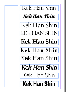
⚫Use your name to practice kerning and tracking
⚫Given body text "I am Helvetica" - arrange and design appropriate text
layout design
3. Process I - Type Expression
3.1 Research
Vibration
For vibration I mainly look into the the formation of vibrancy and ideation
of applying this into word design.
💭For me the word vibration interlinks with motion of ripples on the
surface.
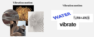 |
| Figure 3.01: Vibration word research, Week 2 (03-Sept) |
Glitch
Throughout research I found some word design with glitching effect with
certain amount of distortion.
💭For me glitch often links with the moderation distortion to the word hence
I think under this word I can explore the extent of distortion happening.
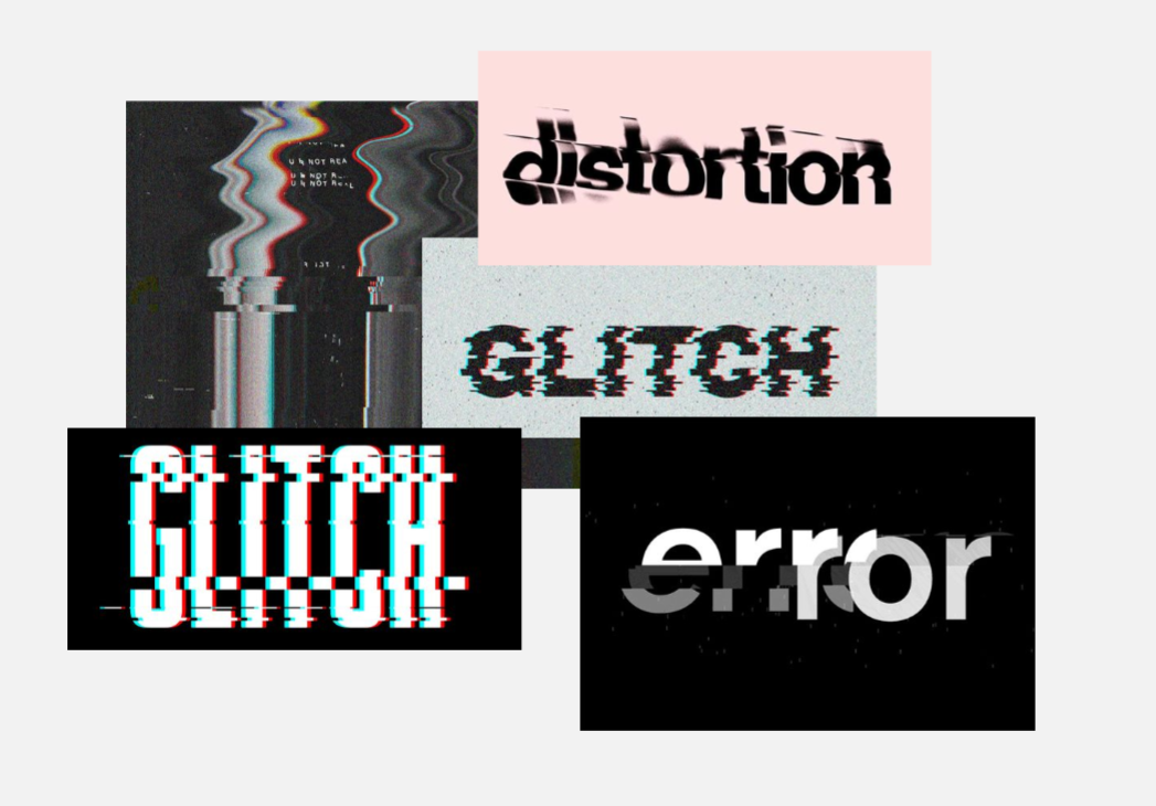 |
Figure 3.02: Glitch word research, Week 2 (03-Sept)
|
|
Roll
For rolling my initial idea is that I wish to include the strong
impression of motion of rolling hence I took reference of kinematic
formation.

|
|
Figure 3.03: rolling and falling, Week 2 (03-Sept) |
Also I found an interesting design that gives me inspiration

|
Figure 3.04: motion word inspiration, Week 2 (03-Sept)
|
3.2 Ideation
3.2.1 Sketches
Roll
-
for this word expression the idea foundation behind I am trying to
express the motion, where the viewer can immediately sense the
rolling action in it. By attempting on this, I experimented with
round rolling "O", or even try to toss the "R". Below are the
ideations:
Sleep
-
Sleep to me is a word with diminishing energy or the need and
urge to lean on something, hence this is the idea I based on
when sketching the ideas.
Glitch
-
In glitch I focused on the highlighted slight distortion in
only some letters to avoid too much distortion but still
demonstrate the damage in right amount.
Scream
-
Scream I would want to experiment with brave attempt to
distort or change the shape of letters to make stronger
impression
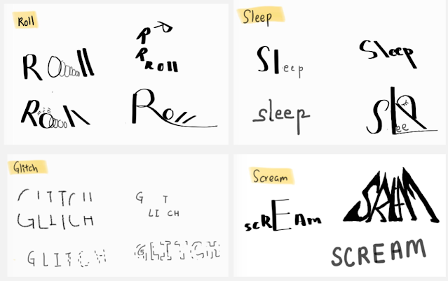 |
| Figure 3.05: Initial sketch compilation on the chosen 4 words, Week 02 (09-Sept) |
Last attempt on sketches based on feedback given
 |
| Figure 3.06: Second attempt on sketch, Week 02 (03-Sept) |
3.2.2 Digitization
First attempt of me familiarizing with Adobe Illustration, I
made a lot of mistakes and faced confusion. Main learnings
from the exploration phase on "scream" to produce below
results: free transformation tool, selection & free
selection.

|
|
Figure 3.07: first attempt on illustration
production, Week 02 (03-Sept)
|
Starting my digitizing work initially I produce design compilation based on the sketches
I came out with.
Below is the outcome of my exploration involving words
like glitch, melt, roll and sleep based on the sketch I
produced.

|
|
Figure 3.08: first draft of digitization based on
sketches, Week 02 (03-Sept) |
Refining
"Roll "
I decided to pick the rolling "o" and wrecking other letters
expression, as in my opinion I think it best demonstrate and express
the motion of rolling, with a more rigorous rolling impression.
Starting from 1st box - top left, I let "O" rolled towards left hand
side, but after one round of feedback from Mr Vinod, he suggested
the opposite way as human read from left to right hence visually it
makes more sense.
By continuing to refine, I enhance the rolling trail behind the
rolling "O" by changing the opacity (from dim to strong) to
strengthen the visual rolling effect. Also I experimented to fill
the "O" so that it can become one focal point of the expression,
emphasizing the intention. Also I intentionally adjusted the
position and alignment of R to make it seems like its kicking the
"O" causing the rolling motion.

|
|
Figure 3.09: "roll" expression refinement, Week 3
(10-Sept)
|
"Glitch"
For glitch I decided to pick below design and continue in refining
it, this is because after listening to Mr.Vinod advice, I have to
have a balance yet memorable visual arrangement, hence in my opinion
the other design in the compilation itself is not strong enough and
might risk causing the combination to be too "soft". With this in
mind, I try to make the design bold and visually filling, also to
fit the purpose of "glitch" expression.

|
Figure 3.10: "Glitch" expression refinement, Week 3
(10-Sept)
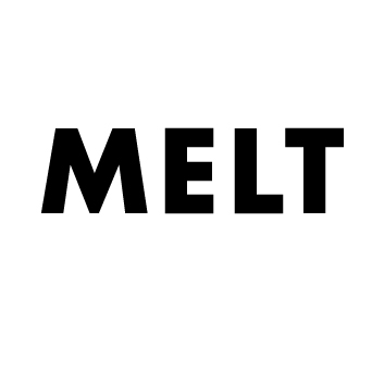
"Melt" & "Sleep"
I didn't work much on these 2 expression as the
outcome is pretty close with the original idea. For
melt I personally liked this the most as there is an
invisible line where the letters start melting into
dark liquid which is very interesting.
For sleep the idea is that I try to make L a leaning
stand for all other sleepy letters, contrasting the
expression and try to make the letters looking as
sleepy as possible.
|

|
|
Figure 3.11: "melt" & "sleep" expression refinement,
Week 3 (10-Sept)
|
Arrangement
When trying to arrange I came out with 2 arrangement, at the end
after looking at it carefully I decided to choose the left one as
the alignment of the "roll" to the right and also "sleep" to the
left is visually more making sense.
Figure 3.12: four column arrangements, Week 3 (10-Sept)
|
3.2.3 Animation
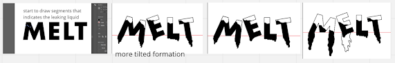
I decided to choose "melt" as the word to animate as amongst other
this is the word I have an overall idea with. In my imagination I
can animate it as MELT filled with black liquid and eventually the
black liquid leaked out, the letters melted.
In order to better mock the melting formation and process I did some
research on the physics of melting.

|
|
Figure 3.13: mock of black liquid flowing, Week 3
(10-Sept)
|

|
Figure 3.14: Melting formation research, Week 3 (10-Sept)
|
By starting I have overall idea on how to design each transition
frame, I start with static unbothered "melt" then eventually the
letters start too tilt and the fill starts to leak out. In my opinion
the most challenging part is to draw the leaking formation and shape,
as the process, dripping area should make sense.
 |
| Figure 3.15: Used brush to draw outline of the liquid, Week 3 (10-Sept) |
At the end it took me 12 frames to sculpt out the overall
process to proceed in making the animated word.
 |
| Figure 3.16: 12 animation frames for the work, Week 3 (10-Sept) |
With these 12 frames the outcome is as below:
 |
| Figure 3.17: the first version of animation gif, Week 3 (10-Sept) |
But I was not really satisfied by the looping effect as it feels
like it is abruptly returning to original state hence how I did is
duplicating the 12 frames and arrange them irreversibly to let the
liquid flow back to the letters.
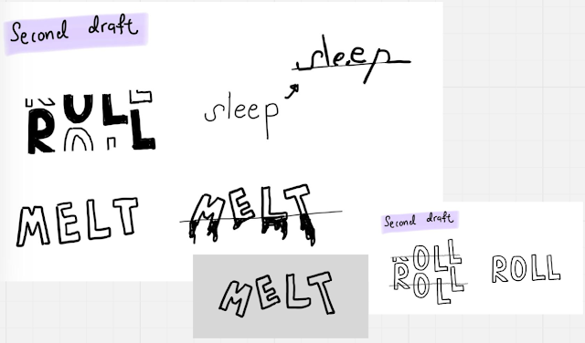
3.3 Final Outcome

|
|
Figure 3.18 Final type expression "glitch, roll,
sleep, melt" (JPG), Week 4 (17-Sept).
|
 |
| Figure 3.19: Final animated type expression "melt", Week 4 (17-Sept). |
3. Process II - Text Formatting
✒Minor kerning & tracking exercise
After watching the tutorial 1, I proceed to incrementally add up the
10 font demonstration and listing, in between I try to balance the
overall visual out by picking between light, bold, italic variation so
that there is certain dynamic in between. Below presented is the
initial draft without kerning and font sizing arrangement.
 |
| Figure 3.20: initial draft without kerning, Week 4 (17-Sept) |
I observed that although I intentionally selected a balanced
variations and typefaces, I realized that without kerning also the
space width in between it will still looked messy.
Hence I by adding the remaining part I decided to adjust the kerning,
font size simultaneously so the fonts can in harmony
 |
| Figure 3.21: adjusted kernings and font size, Week 4 (17-Sept) |
Final Outcome
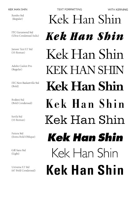 |
| Figure 3.22: Text formatting with kerning, Week 4 (17-Sept) |
✒Minor kerning & tracking exercise
Again before I start anything I jotted down the main points to
note when designing overall layout
🔵character length 55-65
🔵font 8-12
🔵paragraph spacing
same as leading
🔵leading follow point size / 2points
larger
🔵to achieve cross alignment you have to maintain the
leading to be multiples of 2 (even number)
🔵to achieve cross
alignment you have to have the baseline grid turned on
🔵turn
on hidden characters cmd+alt+i

|
Figure 3.23: To constantly check line length I learnt to keep the "info" window opened, Week 4 (17-Sept)
|
Layout #1 ideation
After watching the 4 videos, I started to visualize the first layout
I am intending to try. Since this is my first attempt I decided to
start with simple 2 layout, with one picture at the left, the body
paragraph below I made it not aligned so it doesn't feel bland.


|
| Figure 3.24: Formation of the #1 design, Week 4 (17-Sept) |
|
Also after Mr. Vinod suggested to turn the picture into greyscale I
attempted to edit within inDesign, after searching for solution, I
tried creating a block and make it a layer covering, but it didn't
turn out as intended effect, hence I used external software to edit
the picture
| Figure 3.25: I tried using layer covering to turn picture into greyscale, Week 4 (17-Sept)
|
|

|
Figure 3.26: By editing I adjusted the value of saturation Week 4 (17-Sept)
|
Layout #2 Ideation
By moving on, after my first attempt I get used and familiar to
kerning, font size adjustments, so I decided to make few more
attempts to see if I can come out with more variation. Below are
some research I did to have a better sense of layout
aesthetic-ness.

|
Figure 3.27: More research on sample text layout; Week 4 (17-Sept)
|
after the first attempt I only realized Helvetica is a modern word
typeface, hence I am trying to come out with a second attempt with a
more modern tone, I decided to try out with a more “rounder” and
modern typefaces like Futura and gill sans, and maybe for picture I
will use a more rigid picture to balance the overall visual.
Initial prototype design:
Figure 3.28: Very first attempt on text formatting exercise; Week 4 (17-Sept)
Above doesn't suit what I expected, as the picture seems too rigid,
making the overall layout unnatural and rigid. Hence I switched
picture to a smoother scenery and realigned it.
 |
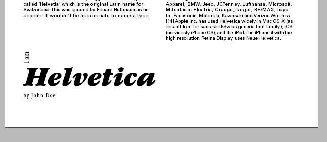
| Figure 3.29: Changed header picture; Week 4 (17-Sept) |
In second layout I decided to make the picture a header as I
like the mountain and shores that the pic is visually inclined to
the left. This is also the reason of why I put the title on the
bottom left.
 |
| Figure 3.30: Heading text on the bottom left; Week 4 (17-Sept) |
Layout #3 ideationFor the last attempt, I started with
the idea of having picture at the bottom right, and extending the
body text from it.
 |
| Figure 3.31: Initial attempt for the #3 layout; Week 4 (17-Sept) |
As shown above I encountered a more prominent "jagged" text, I
was stuck for quite time as I couldn't seem to find the balance
between line length and there are quite number of orphans and
rivers. After some time I managed to find out the issue using hidden
characters. Apparently I accidentally inserted new lines into body
text.
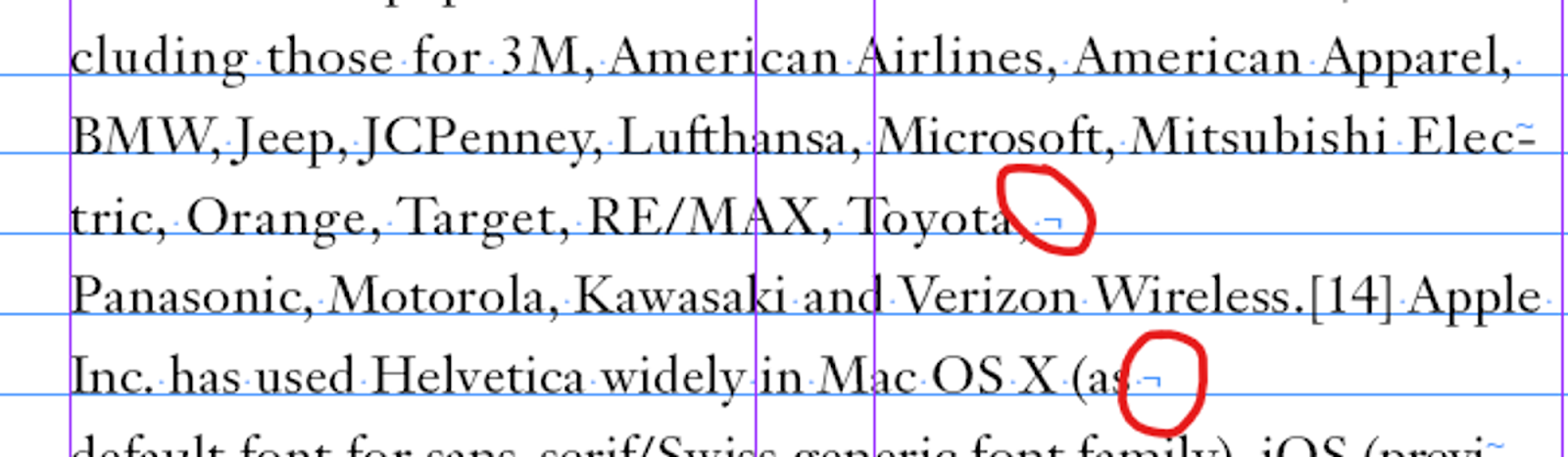 |
| Figure 3.32: line break indicators allowing me to find mistakes; Week 4 (17-Sept) |
Layout #1 - final
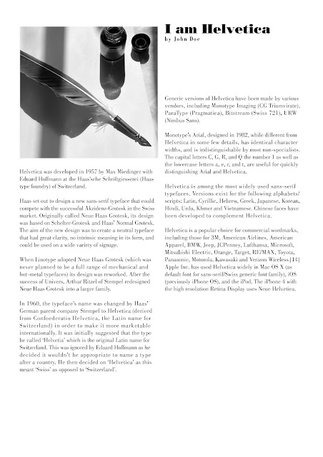 |
| Figure 3.33: Layout #1; Week 5 (24-Sept) |
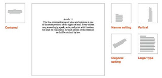
⭕Description: the reader focus point start from top left to the pen
pointer, moving to right, I purposefully create a slightly
misaligned left to right column so that it is not dull and smoother
flow.
⭕Fonts: Bodoni Std/Book (body), Bodoni Std/Poster (headline), Bodoni Std/Bold condensed (byline)
Point size: 11 pt (body text), 24 pt (heading), 12pt
(byline)
Leading: 13.5 pt (body text)
Paragraph spacing: 13.5 pt
Line length: Average 58
Alignment: Align left
Layout #2 - final
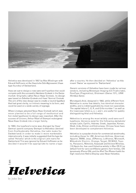 |
| Figure 3.34: Layout #2; Week 5 (24-Sept) |
⭕Description: Used a rather hollow scenery pic as the center pic,
but the mountains and shores are allowing and guiding readers to
move attention from right to left. Below is a rather distributed
body text layout.
⭕Fonts: Univers LT Std/55 roman(body), ITC Garamond Std/Ultra Italic (headline), ITC Garamond Std/Light Condensed(byline)
Point size: 9 pt (body text), 53pt (heading), 12pt
(byline)
Leading: 11 pt (body text)
Paragraph spacing: 11 pt
Line length: Average 55
Alignment: Align left
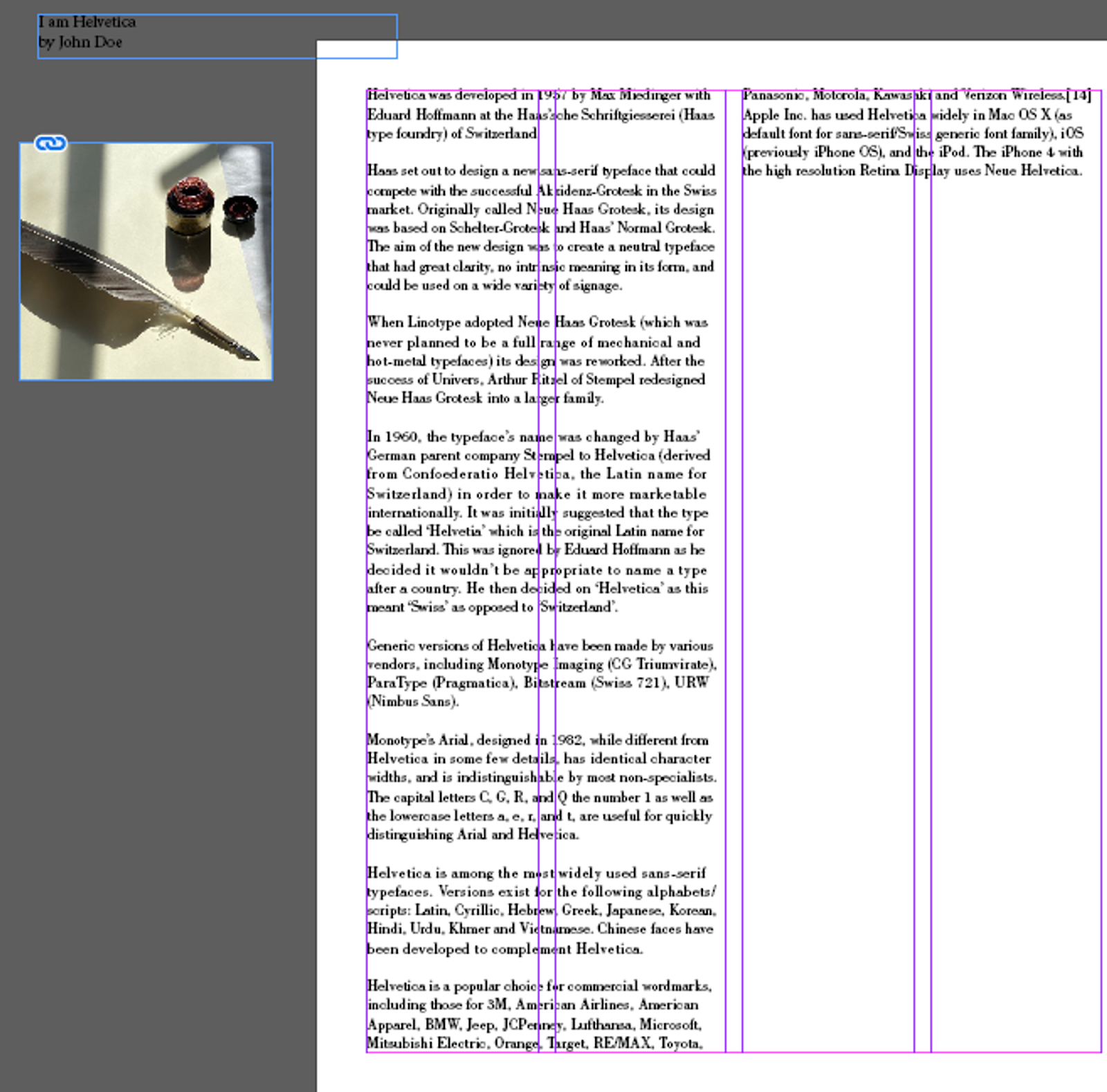
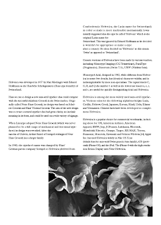
Layout #3 - final
 |
| Figure 3.35: Layout #3; Week 5 (24-Sept) |
⭕Description: Instead of starting from bottom picture I intended to
make focal point
⭕Fonts: Univers LT Std/55 roman(body), ITC Garamond Std/Ultra Italic (headline), ITC Garamond Std/Light Condensed(byline)
Point size: 9 pt (body text), 53pt (heading), 12pt
(byline)
Leading: 11 pt (body text)
Paragraph spacing: 11 pt
Line length: Average 55
Alignment: Align left
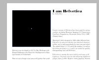
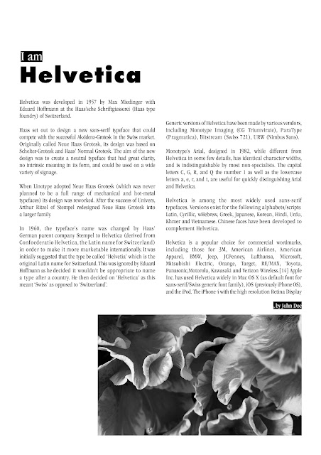
Exercise 2 - Text Formatting Final Outcome
After picking I prefer the third layout hence I present it as final
outcome.
⭕JPEG, 300PPI, Grayscale
 |
| Figure 3.36: Task 1 Exercise 2 without grid; Week 5 (24-Sept) |
⭕PDF without guides and
grids
⭕PDF with guides and grids
⭕ JPEG guides and grids
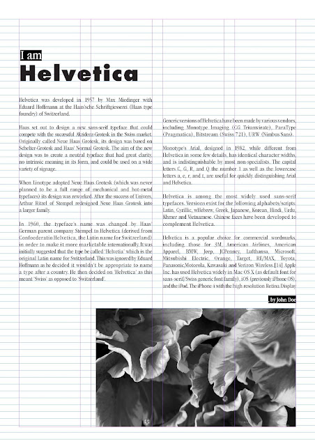.jpg) |
| Figure 3.37: Task 1 Exercise 2 with grid; Week 5 (24-Sept) |
4. Feedback
Week 1
General Feedback
- Reflection remember to add on consistently, waiting till the end is highly not recommended
- E-portfolio itself takes 30%
- To take picture of physical sketches we have to be under natural sunlight or window light or else the quality will be compromised
Week 2
General Feedback
- Blog title should be typography task one, when it comes to design simplicity
is the key have one central main idea and extend it.
- The images falling under research should be collaged into a canva if not you
will have to describe them one by one
- DONT DISTORT THE FONTS, Further eading is required for each week
- Contrast is a good methodology to show
Specific Feedback
> As I have not yet finished up my progress hence lack of specific feedback, way
forward for me is to keep up with the current progress as soon as possible.
>Also the application status of Adobe premium account is still pending from
ICT, I have to follow up for the approval.
Week 3
General Feedback
- for designs, you cant have too much expression, like all over dancing "glitch" and glitching "H" is too much as it will confuse the viewers
- thinner typeface size is bigger, thicker should be shorter, based on the intention and impact wanted
final animation will be only based on the perfect word
- make sure when exporting, include white background, and it should not be 300ppi, it should be 72ppi, when compiling check in photoshop check file size 1024px → ideal, 800px too small, export in gif
Specific Feedback
> For the sketch "O" could add abit more motion linings
> "Sleep" sketch doesnt need to add extra eye if the letters are already leaning towards each other
Week 4
General Feedback
- By arranging four boxes of final word expression together, another thing to be considered is how to make them appear in a visually balance but impactful way
- It's about the effectiveness of the design, it should not be too empty and hollow and losing contrast, the objective is to catch audience attention
Specific Feedback
> Lectures should be watched till third if not it will effect overall progress
Week 5
General Feedback
- Avoid of tight leading and spacing, to test out we can use the one eye rule to see the overall "rivers" within the body text
- task 2 is the combination of exercises we did in task 1
- for headline, do not put expression in every word if not it will get messy
Specific Feedback
> Mr vinod stated the first attempt is ok, just the picture content has to be changed as helvetica is more of a modern typeface
> Picture should be in greyscale
5. Reflection
Week 2
Through the second week I have started to learn more about digitizing,
but what concerned me is that my illustration account subscription
request is still under processing and I couldn't proceed further. But by
sketching the words it initiates my thinking process of how the words
can be expressed. Also I was surprised when Mr Vinod mentioned that the
font shouldn't be too much distorted, hence I have to think of how can I
come out with simple yet expressive word design.
Week 3
I managed to get illustrator installed yet I have to really chase and
keep up with the progress which is to finalize my digitization
designs. As I have complete zero prior experience with illustration
hence it took me quite a while to get familiar with it. I learnt an
important function which is making "compound path", by this I can
group many elements into one for further editing.
Week 4
This week is the most challenging week as I am compensating up the my
progress that is behind the timeline. Especially after finishing the
four expressions finalizing I took time during digitization phase and
they are extra challenging as I don't have prior experience on
illustration. I learnt that as long as you have the willingness to
learn and open to new learnings, you can overcome the things you are
not good at. Besides I learnt how to animate one of the expression by
observing how real life example is and really study the formation of
water dripping down, to make the realistic animation.
Week 5
This week's task for me is quite refreshing and new to me, I realized that text layout actually does impact the reading experience. Good layout with a balanced white space and density can make the reader feel comfortable reading the text. Along the process I discovered few variations of layout and typefaces, also I grasped the basic tools in inDesign software, even for highlighting text I learnt that you have to use underlining as the solution, it is quite eye opening learning experience as it allows my creativity in terms of text designing field.
6. Further Reading

|
Figure 6.01: Vignelli Canon on Design, by Vignelli, Week 2 (10/9/23)
|
Throughout my reading I discovered the motivation of the author to write this
book is that he found out the lack of typography principle in recent works
from designers.
I have researched about the author, he is well famed 20th century modern
designer.

|
Figure 6.02: About the author Massimo, Week 2 (10/9/23)
|
Three important aspects in design
1. Semantics
Before designing, explore and gain clarity on the design on hand is crucially
important. Depends on the subject and objectives, the research direction might
be on the history, product, market. Research part is important as designers
should arrive to a conscious definition of the problem by not only following
our intuition but also funnel the research.
2. Syntactics
"God is in the details". The essence of syntax: the discipline that controls
the proper use of grammar in the construction of phrases and the articulation
of a language, Design.
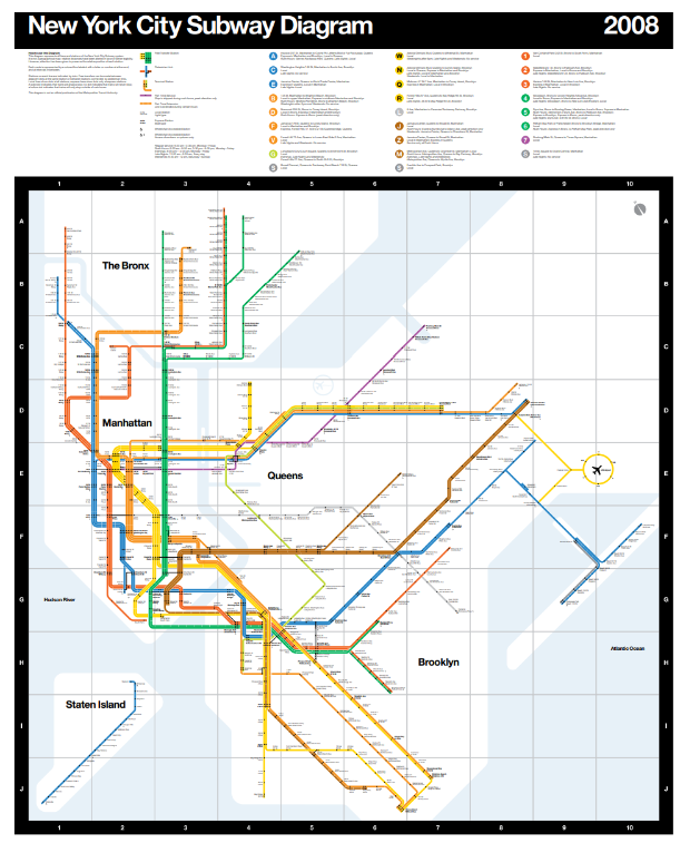
Figure 6.03: Importance of syntactics in complex railway map: structure, grid, typefaces..., Week 2 (10/9/23)
|
| |
3. Pragmatics
No matter how semantically correct and syntactically consistent we think our
designs are, if no one understands the final outcome or the meaning of it, the
entire work is useless. Clarity of intent will translate and show in clarity
of result. Complexity but not complications
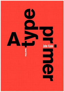 |
| Figure 6.04: A Type Primer 2nd Edition, by John Kane, Week 3 (17/9/23) |
Reinforcing meaning
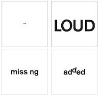 |
| Figure 6.05: Different representation, Week 3 (17/9/23) |
simple choices in typeface, size, weight and position on the page can already convey strong meaning
⚫the example above can express the qualities well like small and lowercase "quiet"
Making sentences, finding sense
 |
| Figure 6.06: Different type display, Week 3 (17/9/23) |
⚫to make sentence more expressive, we can reinforce sense of words though typeplay
⚫designers working with type must always balance the dynamic counter-form and readability
⚫reader's comprehension increases relative to the ease of scanning in text
⚫hence, the point is to have impactful and simple arrangement and least visual distraction
Examine the syntax
 |
| Figure 6.07: Raggedness adding lively form interraction, Week 3 (17/9/23) |
⚫in longer text settings the irregularity of rag is normally undesired, but in shorter instances it provides lively interraction of form
⚫organizing the sense of text horizontally & vertically, generating rich, complex counterform on the page
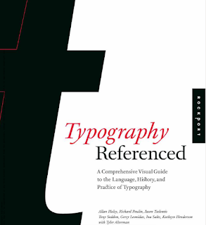 |
| Figure 6.08: Typography Referenced, by Allan et al., Week 4 (24/9/23) |
Typography selection
🟢text type
- have clear understanding of its application is the best way to decide which typeface to use
- for text type use typefaces like caslon, bembo, garamond are suitable for large areas of book text
- line length, word spacing, leading are factors influencing text's readability
🟢display type
- a good display type quickly catch reader's attention
Figure 6.09: Different Text display based on different purpose, Week 5 (28/9/23)
Focus Point 🟢Dynamic compositions, especially those meant to attract a viewer’s attention, often employ a focal point that does not allow a reader to scan starting with the top-left corner.
🟢In these compositions, the designer takes control, telling the reader what to read first on the format
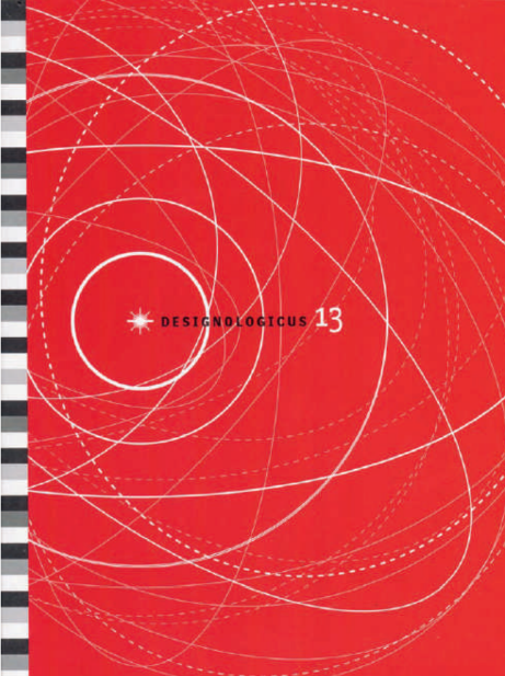 |
| Figure 6.10: straight line of black type contrasting against circular elements, Week 5 (28/9/23) |
Grid🟢a tool allowing designer to create compositions with unity + variety
🟢during grid's creation consider >> media, format, use, image size, typographic scope, etc
🟢there are few grid types including >> book & manuscript grid, columnar grid and modular grid depending on the usage
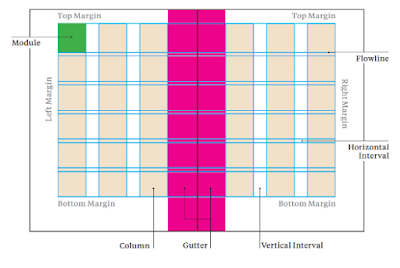 |
| Figure 6.11: Anatomy of a Grid, Week 5 (28/9/23) |


.jpg)


Comments
Post a Comment