Information Design - Exercise 2: L.A.T.C.H infographic
INFORMATION DESIGN
💡Instructions💡
Location / Alphabet / Time / Category / Hierarchy
Organize a group of information into a visual poster that combined and utilizes the LATCH principles (min. 4)
⚫Deadline
Week 2 - 18th Feb
⚫Requirement
Use a digital photo editing / illustration software available to assemble the pokemons into a LATCH infographic poster. You can re-use back the images of the monsters, but do create the rest of your own visuals to complete the poster.
⚫Options
- Pokedex: https://pokemondb.net/pokedex/
- FFXIV Bestiary: https://ffxiv.gamerescape.com/wiki/Category:Bestiary
- Dinosaur: https://www.britannica.com/animal/dinosaur
✍🏼Process✍🏼
Starting the process, Mr Fauzi let us explore the available different data available, as it is the recommended first step before starting the whole process. After gathering the data (types of Pokémon), we will then classify the data into ➡ hierarchy, location, etc. With the guidance and inspiration I start to have ideas on how to develop.
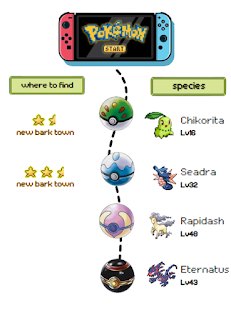
After deciding the four species and types I put them into a canvas so that I can have a clearer outline.
First of all, I tried sketching out the aesthetic design I'm intending to make, as one main challenge for me is how do I make an informative yet visually appealing design. If focusing on information it would be cramped with text, but if focusing on visuals it limits the information to insert.
After some progress I wasn't satisfied with the presentation hence I tried to come up with a more visually appealing story telling.
🎨Outcome🎨
Above infographic is inspired by the concept of conquering and collecting Pokémon from the original game. The viewer is to imagine themselves as the trainer, entering the tower to collect exotic Pokémon. The difficulty and strength of the Pokémon increases when they move from bottom to top. This represents the hierarchy.
💬Reflection💬
This exercise felt harder as the information on hand can be too much, making it harder to categorize and present in an effective yet aesthetic manner. I wasn't really satisfied with the work, but due to time constraint I have to come up with the best outcome I can reach and try better next time. My realization is that when the information is too much, our job is not to cramp everything in, but to pick the most relevant and important ones, so that the message conveyed is crystal clear.


.png)


Comments
Post a Comment