Typography - Task 2: Typographic Exploration and Communication
03 Oct 2023 - 17 Oct 2023 || Week 6-Week 8
Kek Han Shin || 0352571
Typography
|| Bachelor Of Computer Science || Faculty of Innovation & Tech.
Task
2
LECTURES
Lecture 5: Typo_5_Understanding
🔖Unsymmetrical letter case
- because the stroke weights of Baskerville stroke is different that each
bracket connecting the serif to the stem has unique arc
- the right side seemed symmetrical but the width are slightly different
- this shows how designers create letterforms that are internally harmonious
& individually expressive


Figure 1.1 - Unsymmetrical "A", Week 6 (01 Oct)
🔖Similar typeface with varied curves
- the comparison of how the stems of letterforms finish, and how bowls meet
makes huge difference between Helvetica & Universe

Figure 1.2 - Stems and bowls, Week 6 (01 Oct)
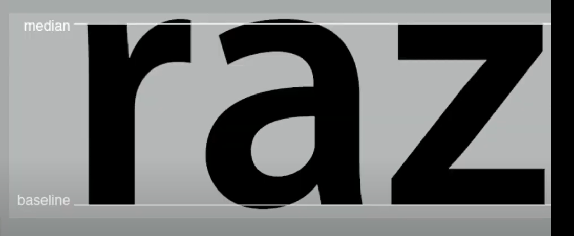
🔖Maintaining x height
- x height is the size of lowercase letterforms
- curved strokes such as 's' should be higher than median or sink below the
baseline
|
| Figure 1.3 - x height, Week 6 (01 Oct) |
- it's good to look really analyze and look into great detail of how the form
is constructed
- understand the form and its counter
🔖contrast
- simple contrasts produces numerous variations
- small+organic/large+machined
- small+dark/large light

|
| Figure 1.4 - Different contrast, Week 6 (01 Oct) |
Lecture 6: Typo_6_Screen&Print
☸Different medium
- although there are prevalent using of screen based typography, but paper
printed designs still play a significant role no matter how
- there are different purpose for different typography - entertainment,
informative, announcement
- skilled typesetters gives highly readable designs layout
- today, typography exists in multitude of screens, subjecting to unknown
& fluctuating parameters
- good for print includes typefaces like caslon, garamond, baskerville
- there are also versatile, easy to digest typefaces
☸Screen type
- taller x heights, eider letterforms, more open counters, heavier thin
strokes & serifs, reduced stroke contrast
- hyperlink: blue and underlined by default
- screen font size: 16 pixel text is the general practice
- web safe fonts includes open sans, lato, arial, helvetica, times new roman,
etc.
- there are huge differences between pixel difference between devices
☸static vs motion
- "dramatize" type for letterforms to become "fluid" & "kinetic"
INSTRUCTIONS
"express typographically the content in this link in a 2-page editorial
spread (200mm x 200mm per page). Choose 1 from the 3 text options provided.
No images are allowed. However, some very minor graphical elements, i.e.
line, shade, etc. might be allowed."
🎯GOAL🎯 The typographic expression has been explored in great variety and
creatively. The expression conceptually and typographically communicates the
meaning being conveyed. The textual information is extremely well formatted
(font size, line-length, leading, alignment, cross alignment, reading rhythm,
information hierarchy, widows and orphans). The layout and composition is
suitable, impactful, memorable, and engaging.
Task 2: Text Formatting and Expression
1. Research
To be honest I feel lost when starting this exercise when seeing the document
dimensions is landscape and I have to accommodate both headlines expressions
and body text. Hence to start, I compile the past seniors work so that I have
an idea how a satisfactory text formatting looks like.

|
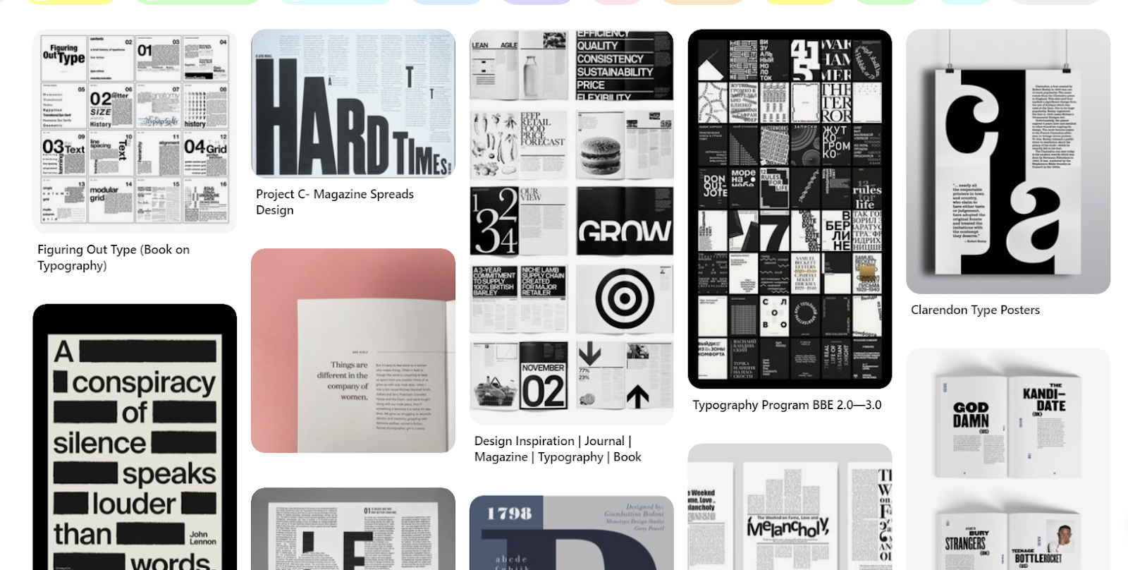
| Figure 2.1.1 - Research on how exemplary work look like, Week 6 (01 Oct) |
|
| Figure 2.1.2 - inspiration exploring on how other layouts are designed , Week 6 (01 Oct) |
2. Sketches & Exploration
Based on my learnings from research stage, I started with sketching initial
ideas.

|
|
Figure 2.2.1 - initial exploration sketches on tablet, Week 6 (01
Oct) |
From above sketches reader can easily observe that I focused more on title expression "code to build on and live by". My idea revolve around "build" word as I think it can give a direct visual impact that attracts reader attention. Also I am trying not to make the overall design too crowded.
Next, I actually started with few title expression according to my sketches.
Initially I tried to use illustrator as an external tool to better express my
word but eventually didn't work out.

|
|
Figure 2.2.2 - expression exploration and trial & error , Week
6 (01 Oct) |
I think this is because when using illustrator I couldn't estimate how much space the expression is going to take and how would it effect the allocation of body text.
Hence at the end I decided to just design my title expression in InDesign.

|
|
Figure 2.2.3 - getting familiar with title arrangement,
Week 6 (01 Oct) |
3. Layout Exploration
The starting of arranging layout did not go well as although I was half way through it was still confusing, as a result, first exploration has not put into selection list.
I found it especially hard when given too huge of a body text it feels too
messy when put into the spaces.

|
| Figure 2.3.1 - first failed layout attempt, Week 7 (08 Oct) |
The starting of arranging layout did not go well as although I was half
way through it was still confusing, as a result, first exploration has not
put into selection list.
I found it especially hard when given too huge of a body text it feels too
messy when put into the spaces.
💡Learnings: make the font size smaller, the more white space the cleaner it feels of your layout. Be aware of how you plan to guide reader's reading direction using different layout: font size, rotation, arrangements.
Exploration #1

Figure 2.3.2 - exploration #1, Week 7 (08 Oct)
Exploration #2

|
| Figure 2.3.3 - exploration #2, Week 7 (08 Oct) |

|
| Figure 2.3.4 - exploration #3, Week 7 (08 Oct) |

|
| Figure 2.3.5 - blocked layout, Week 7 (08 Oct) |
4. Refinements
Exploration #1
- Looking at the "build" I feel like it isn't turn out to be strong or impactful as I envisioned it to be
- hence adjustments are made, changed the variation of the font from black to bold
- and to make it visually more balanced I changed the & to appear thinner, and "live by" to be bolder
Final Layout #1

|
| Figure 2.4.1 - final layout #1, Week 7 (08 Oct) |
Overall I was satisfied as the final outcome turn out to be what I envisioned, the reader starts from bottom left and flow to top right and finally bottom right.
The more I looked at this I liked how it is clean and there is a balance
between the bold expression and white spaces
Exploration #2
- I was not satisfied with the overall representation especially when looking at the blocked it just felt like the layout is not clean and scattered

|
| Figure 2.4.2 - blocked layout reflection, Week 7 (08 Oct) |
- The approach I tried to overcome this is also by changing the font of build, by making it italics and amending the arrangements

|
| Figure 2.4.3 - more exploration on second version, Week 7 (08 Oct) |

|
| Figure 2.4.4 - final layout #2, Week 7 (08 Oct) |
Exploration #3
- I made more refinements by deciding where to put "&" and "code to"
- Or making the "build" font more bolder

|
|
Figure 2.4.5 - more exploration on third version, Week 7 (08
Oct) |

|
|
Figure 2.4.6 - final layout #3, Week 7 (08 Oct) |
I was torn between #1 and #3 outcome, and after consulting with
Mr.Vinod and getting opinion from my peers, I decided to choose the
last layout. Reason: It has more standout visual elements and giving
viewer stronger impression and memorable.
5. Final Outcome
Without Grid
PDF Version
JPEG version, 300PPI, Grayscale
 |
| Figure 2.5.1 - final chosen layout without grid, Week 7 (08 Oct) |
PDF Version
JPEG version, 300PPI, Grayscale
 |
| Figure 2.5.1 - final chosen layout with grid, Week 7 (08 Oct) |
HEAD📄FontsBodoni Std Book Italic("code to"); ITC Garamond Std Bold Condensed ("BUILD"); Gill Sans Std Bold Condensed ("&", "on", "IVE"); ITC Garamond Std Book Condensed ("by")📄Type Sizes30pt ("code to", "on", "by"); 95~271pt varied ("BUILD"); 100pt ("&"); 251 ("IVE")
BODY📄Fonts: Bodoni Std Bold (Sub heading); Bodoni Std Book (Body)📄Type Sizes: 8pts📄Leading: 10 pts📄Paragraph spacing: 10 pts📄Characters per line: ~51 characters📄Alignment: Left Aligned📄Margins: 3p0 (top, bottom, left, right)
Feedback
Week 6
- Avoid playing elements in the center of the spread to not effect
readability when it is folded
- When trying to express the title it is not advised to make outline as
we can't trace back what font we used, also we might distort the words
- It is important to come out with certain variations for him to give
feedback and come out with the best version
- Keep my task on time
Week 7
- Focus on completing e-portfolio and exporting the final works
- Submission for T1, Ex2 (Text Formatting)
- JPEG, 300PPI, Grayscale
- PDF without guides and grids
- PDF with guides and grids
- Export JPEG guides and grids from PDF guides and Grids
Reflection
Week 6
Compared to other task this task is harder and challenging, as I have to
consider more aspects: canvas dimension, title expression and layout
arrangement. And we are given 2 weeks to finish the task on one expression
I have to really explore on different layouts but also consider their
overall tidiness. In the process of exploration, I learnt on how to
utilize different body fonts, make them corresponds and fit into the
general impression - either I want to make it impactful, aesthetic (some
fonts that really fit into are Bodoni/Garamond). Overall the whole process
started of confusing and stressful but when seeing the outcome it is
satisfying. I am quite proud of myself to be managed to come out with 3
versions of layouts.
Week 7
In this week nothing much have been amended but just refining and finalizing
designs. To be honest I was choosing between design #1 and #3 as the former
has a cleaner, more impactful impression and the latter has a more
aesthetic, "magazine" vibes. After consulting with my peers I decided to
choose the last design. One feedback that my friend gave is they like how
the last design is more "eye catching" and memorable. Other friend suggested
me to adjust the position of BUILD.
Further Reading
|
| Figure 3.1 - more exploration on third version, Week 7 (08 Oct) |
Reference:
Carter, R., Day, B., Meggs, P. B., Maxa, S., & Sanders, M.
(2015). Typographic design: Form and communication.
Hoboken, New Jersey: John Wiley & Sons, Inc.
Legibility
- is achieved by controlling the qualities and attributes that make type
readable
- the 3 most important qualities upon legibility is dependent
contrast
simplicity
proportion
- some great examples are bodoni, baskerville and garamond
✍🏼Characteristics of letters🎱
- Letters can be clustered into 4 groups
vertical
curved
combination of vertical & curved
oblique

|
|
| Figure 3.2 - Four groupings show the structural relationships of all letters in the alphabet. The divisions are based on the dominant strokes of each letter , | Week 7 (08 Oct) |
- Lowercase letters can be ranked according to their distinctiveness
as follows:
d k m g h b p w u l j t v z r o f n a x y e i q c s.
- the most illegible letters are the vowels while c g s x are more
easily missed
- f i j l t are the examples of letters that can cause
confusion
✍🏼Capital & Lowercase letters🎱
- word set in all capital letters is characterized by a straight horizontal
alignment, creating an even word outline with letters of similar shape and
size.
- text set in lowercase letters are distinct based on their irregular shapes
and internal pattern

|
|
| Figure 3.3 - comparison by reading both UPPERCASE & lowercase letters, | Week 7 (08 Oct) |
✍🏼Weight🎱
- weight also significantly contributes to the legibility of a typeface
- light typefaces cannot be easily distinguished from their background
- heavy typefaces are too heavy and lose its internal pattern of counterforms

|
|
| Figure 3.4 - Examples of different weight and its impact of legilibity, | Week 7 (08 Oct) |
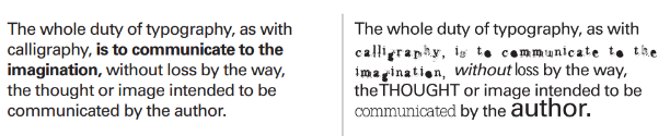
✍🏼Consistency🎱
- begin with the same typeface with the same type size, add additional
typefaces, sizes and other variations only as needed
|
| Figure 3.5 - Left side presents more consistency and readability, Week 7 (08 Oct) |
- interletter, interword and interline spacing should be based on spatial
character on the typeface in use
- When setting flush-left, ragged-right or flush-right, ragged-left text, the
effort to create pleasing, feathered rags will prevent text blocks from
acquiring awkward shapes

|
| Figure 3.6 - ragged shape are not desirable, Week 7 (08 Oct) |
-Using a baseline grid aids in aligning adjacent columns of text and in maintaining proportional harmony among individual text units
- When using contrasting type weights in the same size, reduce the size of
heavier text to make it appear the same size as lighter text

|
| Figure 3.7 - weighted text can be reduced in size, Week 7 (08 Oct) |
Syntax & Communication
- the elements of design -> letter, word, line, column, and margin are made
into cohesion
🎫Letter🎐
- although the letter typically function as part of word, individual letters
are combined into new configurations
- in illustrated examples, we can add expressiveness and boldness to the
individual letters

|
||
| Figure 3.8 - This composition demonstrates contrasting visual characteristics of three letterforms | , Week 7 (08 Oct) |

|
| Figure 3.9 - through precise letterform drawing and carefully considered form-to-counterform interaction, two dissimilar letters form a cohesive sign, , Week 7 (08 Oct) |


Comments
Post a Comment